
translating the agency brand into a website.
Chief Creative Officer Danny Robinson trusted me to design and develop the new Martin Agency website. So, I asked of our design directors and top execs for feedback all along the way.
We won 2023 Ad Age Agency of the Year
reflecting the strength of the portfolio design, framework and digital brand positioning.

And we placed #6 on Fast Company’s Most Innovative advertising agencies, just behind Wieden+Kennedy and Ogilvy.

And read the good things our CEO said about the site
(and several others)!! 👌🏽😋

To help stoke the fire,
I produced and directed a new agency reel, which is the first video you now see on our homepage.
-
Each year, our internal teams figure out ways that we can inventively display our work.
If you’re in the ad industry, you’ve probably barren witness or maybe even been apart of the dreaded agency website redesign process. If not, maybe you’re lucky.
I’ll give you a peek behind the curtain — our website has long been problematic. But it’s no fault to our own — it is a dance of budgeting, resourcing, technology limitations, competing priorities, legal limitations and creative opinions that amalgamated to generate a near-impossible mission.
Let’s face it: everything is an ad.
If you’ve followed Martin in the news, you’re likely aware that we’re pretty particular about the clients that we work with. We don’t dive into relationships headfirst. We’re cautious… kind of like using a dating app. We swipe through pictures, do a thorough stalking on the internet, vet out associations, check out what the past brings up via some Google searches. While, yes, we do all of that — there’s a lot more to our actual vetting process than my dramatic, oversimplified comparison.
At Martin, we tend to go after clients (rather than brands) in a world where a lot of agencies are obsessed with having brand names on their client rosters. We seek out clients we know do good work. Clients that trust us. Clients that will take a chance. Clients that will fight for more budget when we feel it’ll benefit. Clients that have a long track record of respecting the creative process, while pushing us to do better.
So when Martin asked me to produce our new website, I knew I’d have to do everything in my power not to try to copy what our competitors do through their sites.
Then I began to think: well, what how does Martin approach work? What does make us different?
The raw reality? Each of the people that make up our agency bring in their experiences, personalities, life-challenges, family lives, and skills into the output of creative work that end up being seen by millions of consumers every day. As an agency, on the whole, we infrequently look around at others and compare ourselves. Well, we admittedly do it, but then remind ourselves it always turns out bad when we do too much comparing.
As we were laying out each page, I wanted to exemplify that fact. The fact that every other agency site is full fancy features, animations, and intense sentences that do nothing except for confuse viewers as to the work that they do — and the people that they are.
Like your dating profile, your entire self is important… not just the work that you create. So how do we communicate that through our website?
Is the art actually good? Or is it just the frame?
A beautiful frame on artwork can really make anything look desirable. Up to this point, I’ve largely worked in public relations, corporate communications and public affairs for large and intense corporations. I’ve made a lot of lukewarm things look seemingly cool.
But, a never-talked-about factor remains: younger generations grew up with a lot of B.S. that have necessitated a sniff check on nearly everything that is put in front of them prior to consumption, adoption and promotion.
Like war, presidents, trans fat, rainbow-washed profile pictures, NFTs and more.
The same goes for advertising. Consumers, more than ever, are no longer interested in how brands seek to frame up their existence. It’s how they actually act. The art within the frame. The actions behind the words.
Within our own brand at Martin, we’d run around for months trying to figure out what our brand actually is. We have a logo. We (sort of) have a color palette. But undefinition can be a beautiful thing. Not silence. But fluidity.
I recently confirmed that with our chief creative officer, Danny. When I shared all of of my frustrations about how we don’t have a 96 page brand guidelines document, he looked at me with a smirk. He was confirming everything I was telling him. Because that’s exactly the way we set ourselves up — intentionally. Like many of the brands we work on, we’re constantly evolving depending on the people that are behind the scenes. Like living in the grey (ironically our brand colors are black and white) - but learning to be comfortable with it.
That principle alone inspired us to figuratively create an ultra-simplistic frame for the beautiful work that the people here at Martin pour their hearts into on behalf of our clients. Almost like a beautiful painting hanging on super clean gallery wall in a museum with a thoughtful little bench placed front and center so that you can take a seat (or stand closer if you wish), catch a breather from the world’s noise, and take it all in.
As the design of Martin’s site goes, the result meant less B.S. to sift through, more room for interpretation of our advertising, and fewer distractions that might inflate your opinion of the work that we’re doing.
Full disclaimer: there are a few tiny Easter eggs here and there that we just thought were funny to add in. But those were added mostly for our own LOLs, not for you. Sorry.
We’re not perfect — but that’s also not our brand
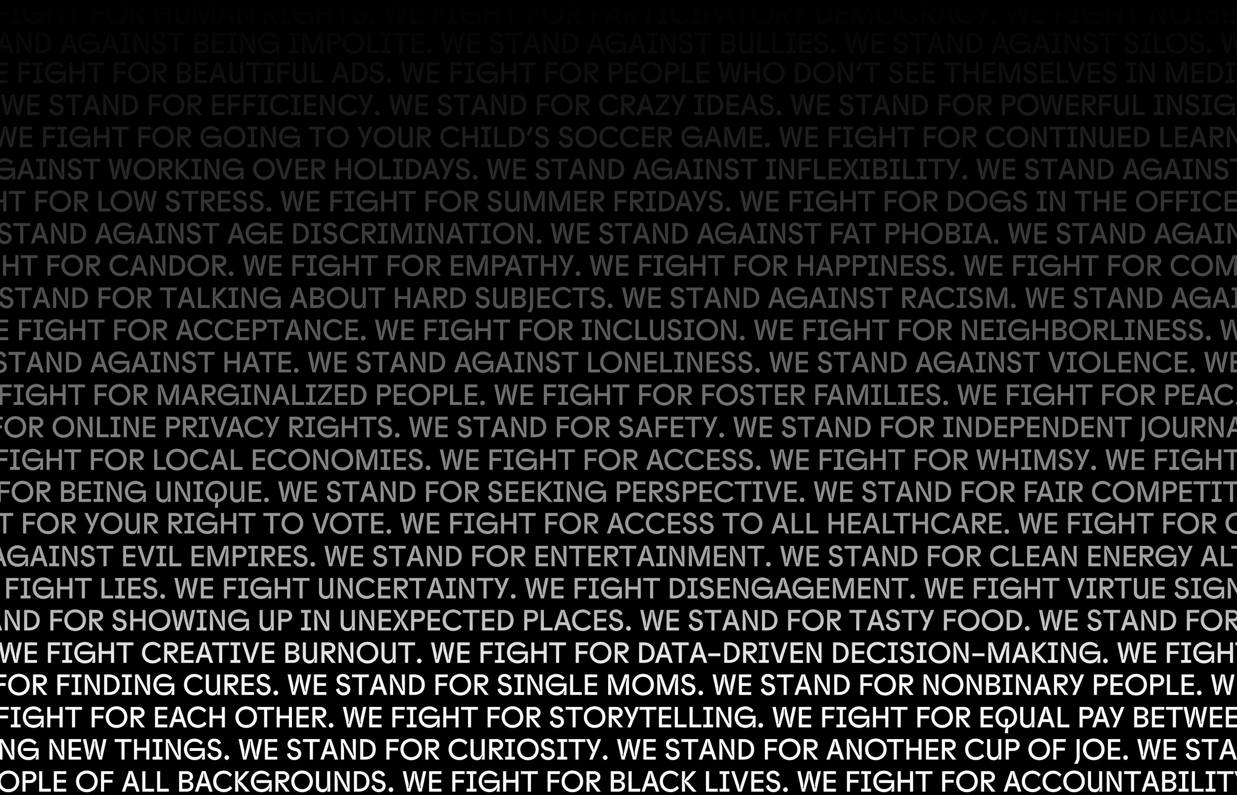
What if I told that we have an imperfect presence — by design? We definitely don’t intentionally walk out the door with imperfect vision, strategy or work. But everything we do — the way we operate, where we’re located, the clients we work with, what we’re focused on fighting for… is subjective. We get to work on large brands every day, and influence how they’ll be perceived in a world that — lately — has felt ultra imperfect. A lot of agencies sell their work as the be-all-end-all. Conversely, we position each campaign we do to act more like a single fighter in a battlefield full of controversy. In our current state of existence, there’s no such “magic bullet” of work out there. It’s tone of our voice, causes we donate to, approaches to tackling problems, and how we spend our time in addition to the work that we output.
One thing that we had received feedback on — and adjusted for — is that we’re an agency that seemingly doesn’t do, “big-picture master brand work.” And that couldn’t be further from the truth. If you had a single conversation with our chief strategy officer, Elizabeth, you’d quickly find out how every ounce of work we do is informed by incredible research, insights, tested messaging, and more. And how that work all seamlessly connects to a strategic platform (I tend to believe our entire approach to master brand is rather proprietary, so I’ll leave it at that).
But it was our old site’s fault. We previously oversimplified the foundations on which we impact culture in specific ways for each brand, ultimately winning sales for our brands. Previously, our site design had prevented us from being able to share the master brand foundations that our clients’ campaign works sit atop.
Through a better design, we course-corrected and we now integrate both the campaign strategy and master brand strategy of every featured project through either words, press mentions, visuals or secondary video content.
Democratizing creativity and keeping our eye on the ball
Our entire site was built on an affordable platform that costs will cost the agency about $250/year to maintain. We can build pages and display work without the need for an arduous process.
Initially, we were evaluating different solutions that would allow us to do this. Many have strengths and weaknesses.
One night, I stayed up until about 3 am putting together a test site after receiving a bid for over $100,000 for development costs only. That didn’t include the teams that we would need to assign to the process to get the job done.
So I jumped on Squarespace — one tool that has increasingly become more affordable, flexible, technically superior and scalable. The base design for the site started rough. But our head of production, Tasha, caught wind of my annoyance with the fees it would take us to achieve a beautiful end-product.
Within minutes, she took my test site up to our highest level of leadership at the agency, came back and said, “They all loved the sample. Proceed.”
So we did, and using the platform has inadvertently made a pretty loud statement about us. We’re willing to adopt new ways while relentlessly keeping our eye on the ball — spending time and resources where it’ll serve us best: our people, clients and brands.
With that being said — I have to add an asterisks. SquareSpace has not yet built in tools that natively provide the best browsing experiences for people with epilepsy, visually impairments, ADHD, cognitive disabilities, motor impairments, vision loss, color blindness or blindness. The platform may not natively protect users privacy either (at least up to privacy and tracking standards that laws in Europe require). To counteract, Martin has attempted to exceed industry requirements for accessibility and cookie consent through external services like UserWay and Cookiebot. Each of these services requires a monthly fee which we feel are well worth the investment to improve the way that users of all abilities can interact with our brand.
In summary, that’s the story of this website. We hope you enjoy our dating-profile-eske, ultra simplistic, creatively-accessible web experience that helps you better identify how we and our clients are positioned in the world and the things we’re fighting for.

Cross-platform brand design elements, like LinkedIn cover photo, were also produced.
Role: lead digital producer, architect and product owner